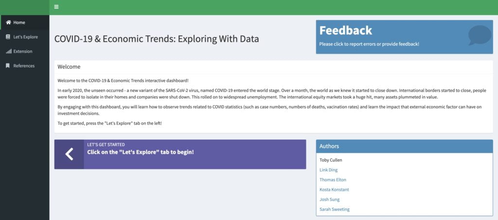
The Covid-19 vs Stocks dashboard was created as part of a group university assignment. Our team created an interactive classroom experience, where students would learn the basics of data science by exploring data relating to Covid-19 and Stocks.
Provided below are some excerpts from our project report documenting the dashboard.
Introduction
In the last few decades, pedagogy has seen a shift as traditional didactic lecture-approaches have been seen as ineffective as opposed to active learning models of teaching (Jungst, Wiersema & Licklider, 2003). Active learning is a teaching strategy where the student plays an energetic and dynamic role in their own education, where they are not a passive participant in the classroom, rather, they actively engage in classroom activities (Petress, 2008; Felder & Brent, 2009). Active learning has been shown to have positive outcomes on student learning, as well as stimulating critical thinking and positive attitudes towards class (Gorres-Martens, Segovia & Pfefer, 2016; Bokosmaty, Bridgeman, Muir, 2019).
Keeping this literature in mind, we created an interactive dashboard lesson to aid New South Wales commerce and economic teachers in delivering an engaging lesson relating to the effect of Covid-19 on equity prices. Students are prompted with discussion questions, but ultimately, students drive their own educational experience via actively engaging with dynamic graphs and interactive features. The lesson objectives for the dashboard were made to align with key syllabus dot points.
Additionally, in designing the dashboard, key attention was paid to cognitive load theory (CLT). CLT is an instructional design theory which accounts for how only small amounts of new information can be processed in short-term memory at any given time (Sweller, 2011). This is due to the limited capacity of short-term memory (Miller, 1956; Hulme et. al., 1995; Service, 1998), and how if this limited capacity is exceeded, new information is not successfully encoding into one’s long-term memory (Martin, 2016). Information not being stored into long-term memory clearly represents a failure in pedagogy, as one of the goals of teaching is for students to retain what they have learned. This led to the dashboard design described in the next section of this report.
Methods – Data Sources
The dashboard requires data to analyse, and as such, two main data sources were acquired. The first was COVID-19 data set on GitHub from John Hopkins University. This data set aggregates data from multiple international sources, allowing for an international timeseries of COVID statistics (statistics such as cumulative covid cases, cumulative deaths, vaccination rate, etc.).
The second main data source was timeseries stock prices which was acquired through the use of application programming interfaces (APIs). The dashboard utilised two APIs, the ASX company directory API, and the Yahoo Finance API.
Methods – Creating the Dashboard
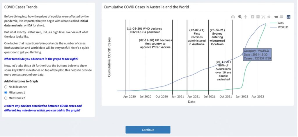
The dashboard was designed primarily utilising the Shiny and Shiny Dashboard R packages. In accordance with CLT, as well as ensuring that the active learning roots of the dashboard were maintained, careful design choices were adhered to. As such, questions were designed with self-discovery in mind. This is evident in Figure 1.

Figure 1: Example question in the dashboard where students are asked guiding questions (in blue), and are then free to explore the plot on the right to inform their answer. The code to produce these plots in the shiny is given in the code chunk above.
As evident from the figure, students are given guiding discussion questions, which are always highlighted in blue for consistency. Students are then free to formulate answers in response to these discussion questions, by toggling buttons (see the “Add Milestones to Graph” in the left of Figure 1) and observing the effect to the graph on the right of the information text box. Additionally, students can interact with the graph by zooming in, or even just hovering of the lines, such as how in Figure 1, the mouse is hovering on the blue line, causing an informative blue text box to appear.
Additionally, to reduce cognitive load, each module in the shiny is separated by a blue continue button, which a student must click to proceed to the next section (as seen in figure 1). The theoretical basis of this is that it limits the visual stimuli on the scream, helping student to focus on the content in front of them. This aims to reduce the volume on short-term memory and should theoretically aid students encoding newfound content into long-term memory.
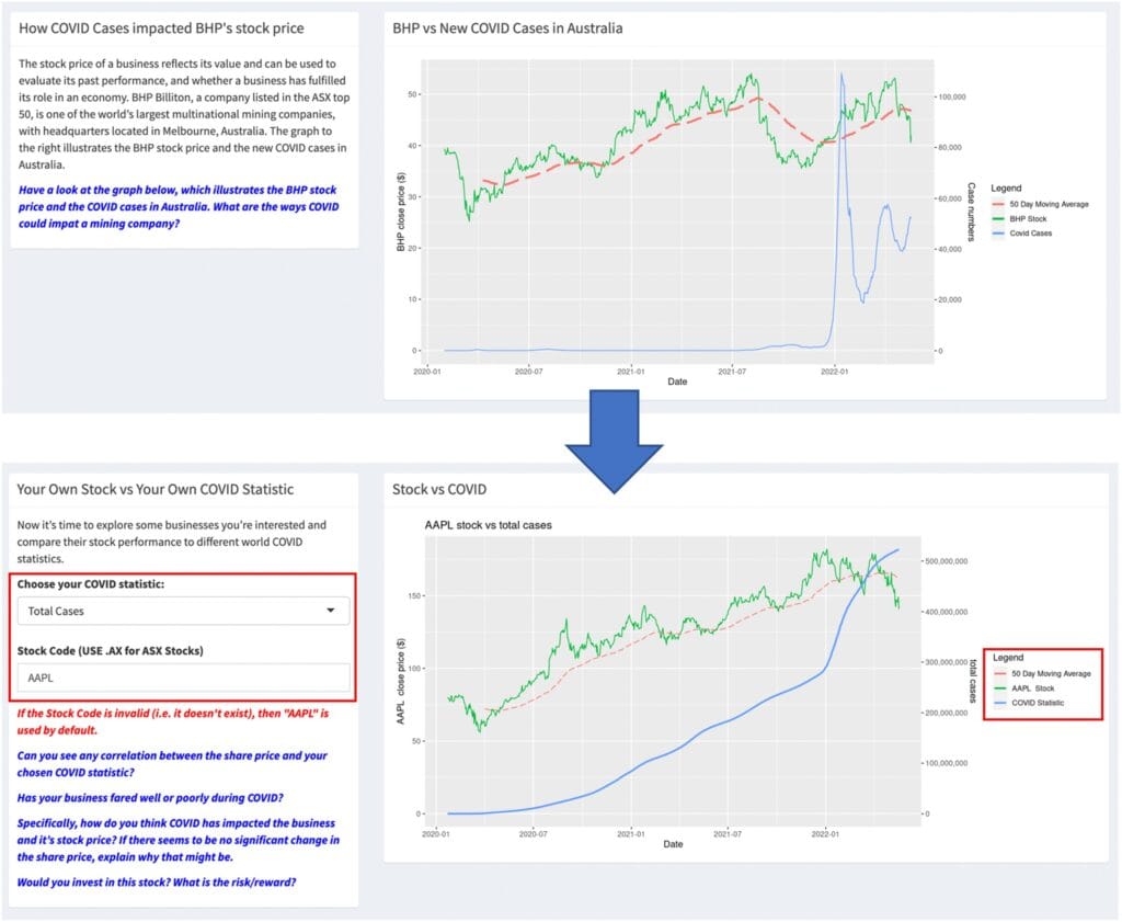
Another consideration regarding CLT was for modules to build upon each other. This was designed in such a way so that students could become familiar with simpler examples, before moving on to more complex ones. This is evident in Figure 2, which indicates how a module where students observe the trend in COVID cases in Australia vs the BHP stock price, is followed by a module where students are presented with the same graph, yet this time they can alter the stock and COVID statistic being used. This allows students to comprehend the simpler visualisation, before moving on to the more complex one.

Figure 2: The top module is a more restricted version of the bottom module, meaning that students have the opportunity to master the simpler version, before moving on to the more complex one.
References
Please refer to the GitHub link below for the full references.
The link below takes you to the dashboard and GitHub source code:
Return to portfolio page: